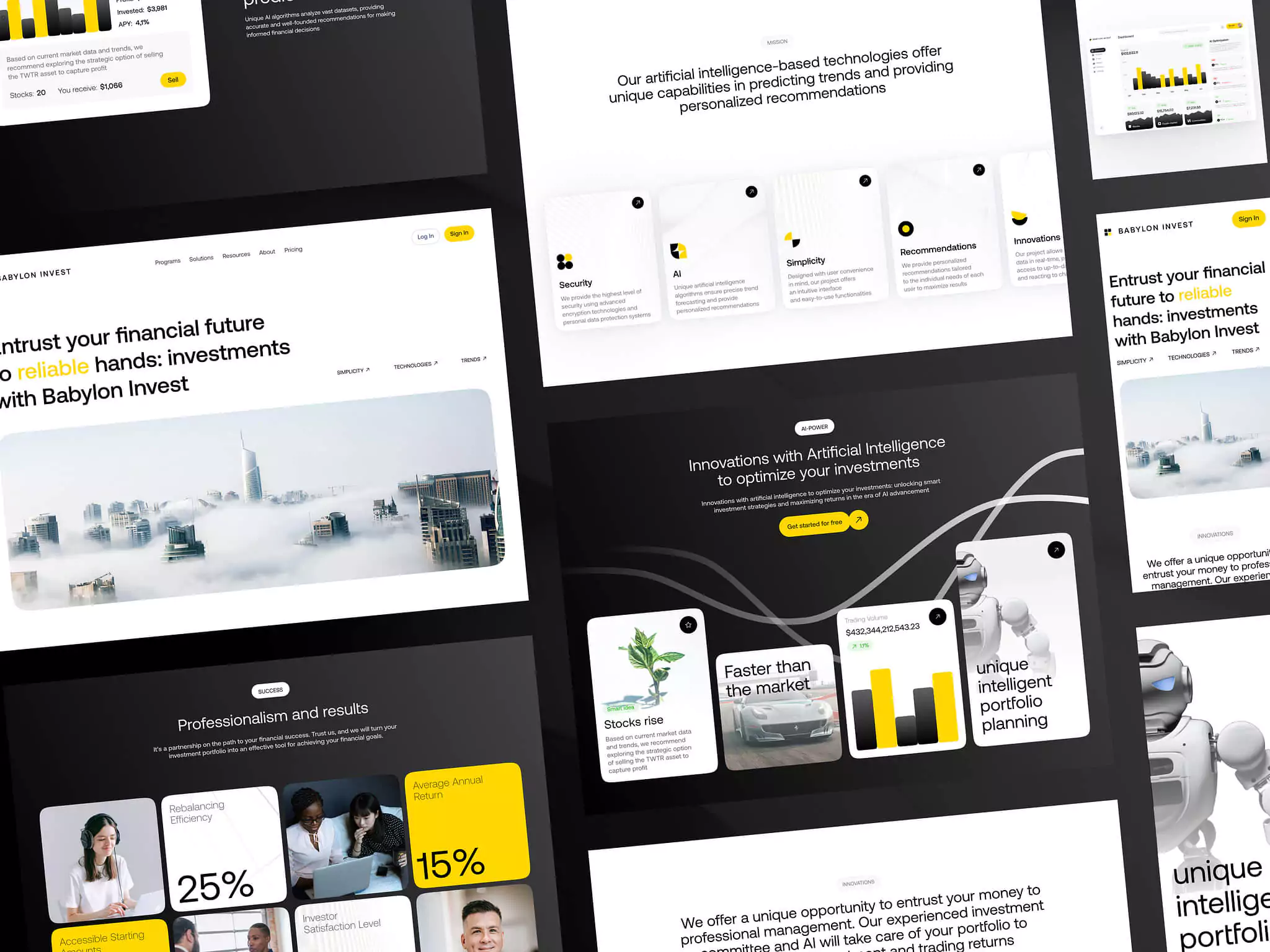
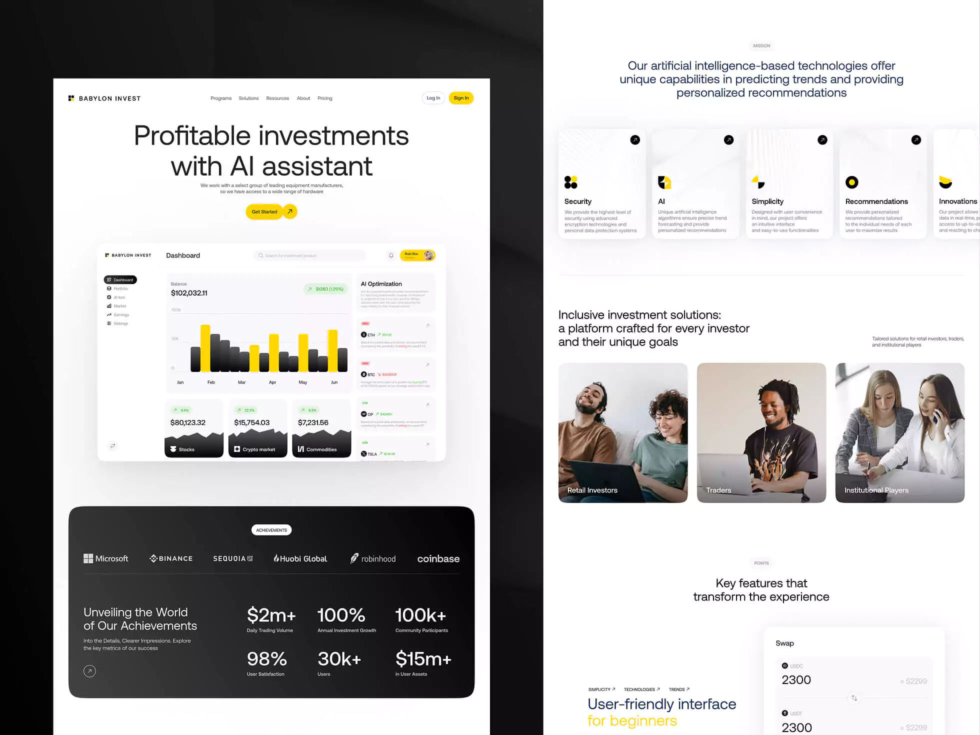
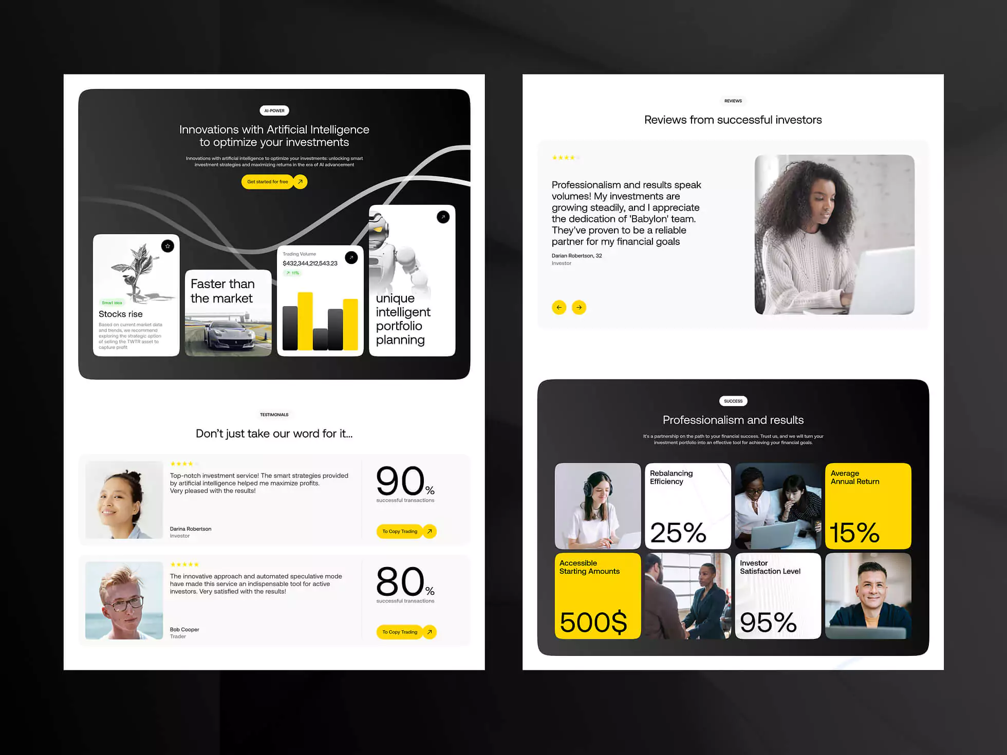
BABYLON INVEST
THE CHALLENGE
Creating a responsive design that functions seamlessly across a wide range of devices was a significant hurdle. Ensuring that our site looked and performed well on both large desktop screens and small mobile devices required meticulous planning and testing. We utilized CSS media queries, flexible grid systems, and responsive images to address these issues, ensuring a consistent user experience.
During the development of our website, we encountered several key challenges that tested our problem-solving skills and technical expertise.
THE SOLUTION
To achieve cross-browser compatibility, we conducted comprehensive testing on major browsers, including Chrome, Firefox, Safari, and Edge. We used browser-specific prefixes and fallback solutions to address inconsistencies. Tools like BrowserStack helped us test on different browsers and devices efficiently, ensuring our site performed well regardless of the user’s browser choice.


SERVICES INCLUDED IN THIS PROJECT
LET'S GET IN TOUCH
Send us an inquiry and get an estimation.
